I have never seen a poppy look so sad.
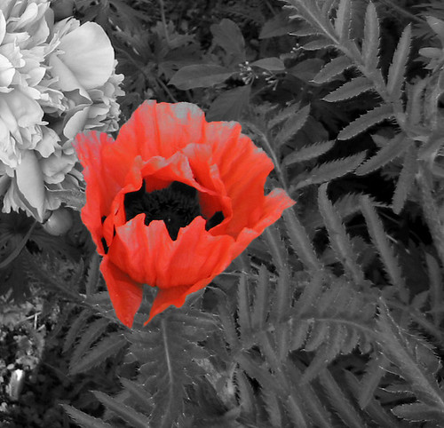
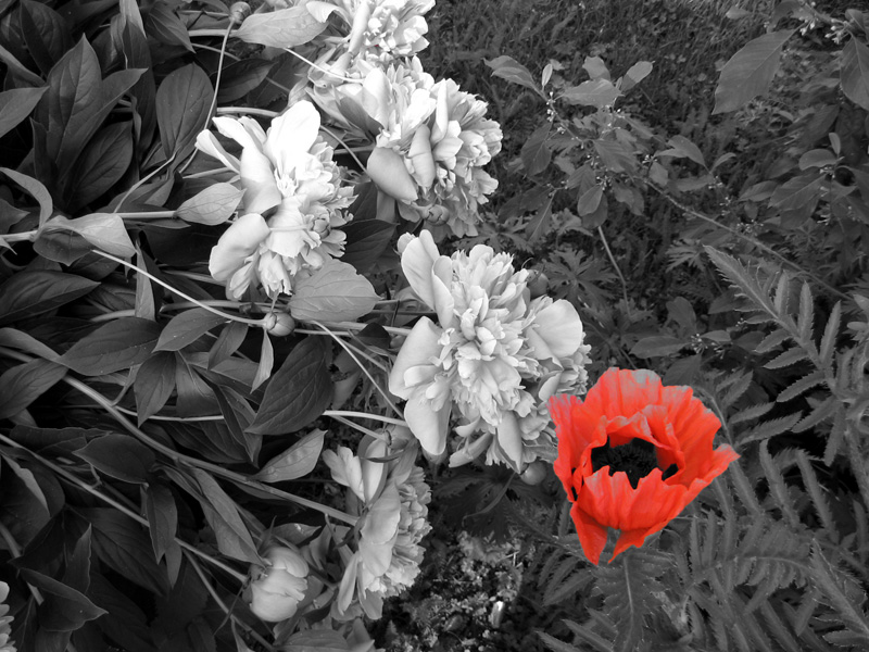
I discovered that my camera has a colour accent feature, so I started playing with it. I think this effect is generally overused, but it is kind of fun! I took garden pictures, of course, but I think it was quite effective on the poppies.
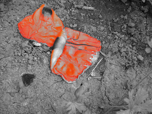
These poppies are startling enough in real colour because they are vibrant red-orange. (Plus, they are next to the deep-purple irises. Woo for contrast). I think red and gray are a startling combination, though. When I looked at my photos I immediately thought of remembrance day. Poppies, gray, blood, mud, death, Belgium. Aaaaah.
0 comments:
Post a Comment